April 26, 2024
Jumpy Curvy Things in Tableau

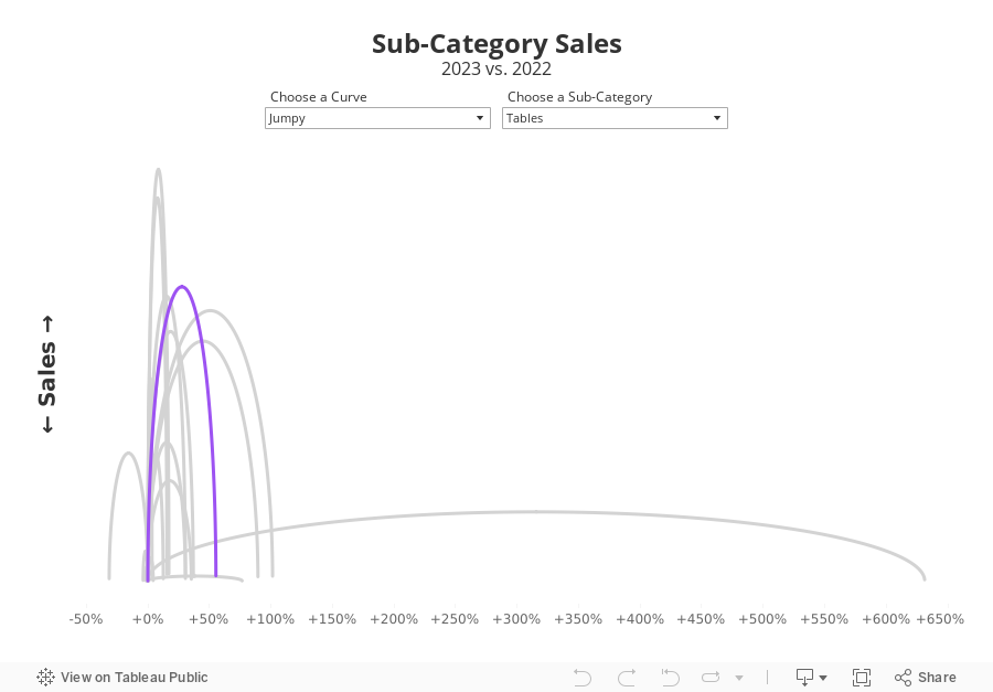
I received a request to teach how to build a jump plot during Next-Level Tableau office hours. The idea was to recreate this visualization that I created for Makeover Monday back in 2018.
The problem, though, was that the data preparation was done in Alteryx, which I no longer have a license for. Thanks for a member of NLT that had an Alteryx license, we were able to decode what the workflow was doing.
Then, in office hours, we recreated the data prep in Tableau Prep before building the visualization in Tableau. Download the Prep flow here. Download the workbook below.
This is just one example of one thing learned as a member of NLT. Sign up today and I guarantee you'll become a Tableau expert.
April 25, 2024
The ULTIMATE Guide to Custom Visualizations in Tableau
Here's the ultimate guide to custom visualizations in Tableau. Each chart contains a link to a tutorial so you can build it too.
I rarely use these charts on a day-to-day basis, but they are a fantastic way to build your technical skills.
Have you used any of these in a business context? Click on the image to view on Tableau Public.

April 24, 2024
20 Dashboard Design Best Practices
April 23, 2024
How to Create Rounded Bar Charts in Tableau
April 21, 2024
How to Create Custom Date Hierarchies in Tableau
April 20, 2024
The What, Why, and How of Custom Dates in Tableau
Why you should build a Tableau Public profile
April 18, 2024
How to Create a Donut Chart in Tableau
Which chart would you like to show?
Beginners and advanced designers alike get stuck deciding which chart is right for their data. Next time you're stuck, try this chart guide by Damola Ladipo.
Check it out on Tableau Public here. Click the image below for a hi-res version to print.

April 16, 2024
How to Create a Bar-in-Bar Chart in Tableau
April 13, 2024
25 Example to Help You Master Calculations in Tableau
How to Create a Proportional Stacked Bar Chart in Tableau
Proportional stacked bar charts are a good way of showing the size and proportion of data at the same time.
April 10, 2024
How to make sense of ANY data set
Demystify ANY data set by answering 5 simple questions:
- When?
- Where?
- Which?
- Who?
- Why?
----------
P.S. Newsletter subscribers get a deeper dive into each of these for FREE when they sign up. Go to andykriebel.com to get yours.
11 Ways to Compare Two Measures
I don't believe in complexity in data visualization. I stick with simple charts when you needs to compare measures to add context.
Tableau workbook here.
April 9, 2024
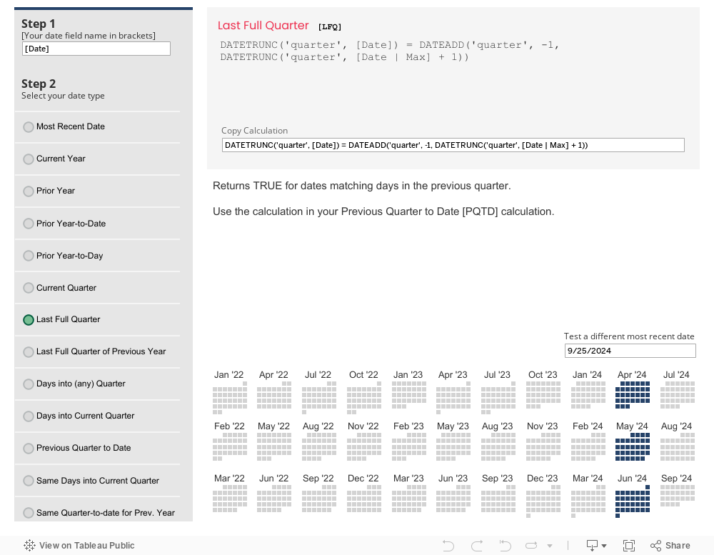
The Ultimate Tableau Date Calcs Cheat Sheet

How to Create a Floating Bar Chart in Tableau
A floating bar chart is similar to a Gantt chart, except it shows the range of two data points instead of two dates.
April 8, 2024
How to Create an Enclosed Dot Plot in Tableau
An enclosed dot plot is similar to a barbell charts except the line connecting the dots surrounds the dots.
April 7, 2024
How to Create a Barbell Chart in Tableau
A barbell chart is a dot plot that shows two or more points and also connects those points to display the range.
April 6, 2024
How to Create a Histogram in Tableau
A histogram visualizes the distribution of data over a continuous interval. Each bar represents the frequency at each bin.
18 Ways to Visualize Bar Charts in Tableau
The SECRET to never choosing the wrong chart...the Bar Chart! Here are 18 options for your next bar chart.
Tableau tutorial and workbook here.


