October 26, 2010
Improving on the Blogger Stats Dashboard
Recently Google added the Stats feature to Blogger blogs. It's basically a dashboard very similar to Google Analytics, just stripped down (like Tableau Public vs. Tableau Desktop). There are four tabs, three of which are well done (Overview, Posts and Traffic Sources). However, the Audience dashboard is poorly designed.This is the Google version of my blog stats from May 2010 - October 2010:
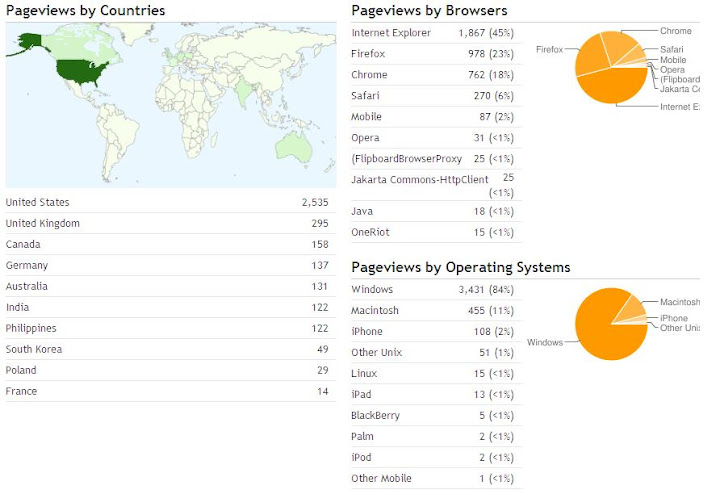
The map is well done, as you would expect, though it's tough to see the light green on the countries with less pageviews. I like the table below the map as a reference.
My issue is with the pie charts on the right. The tables are sufficient for my needs, especially since it has the total pageviews as well as the % of total. The pie charts are shown in descending order, but you have to work to find the starting point; as I've said in the past, pie charts should always start at the 0 degree mark when used.
If I were to visualize this dashboard, I would create it like this.
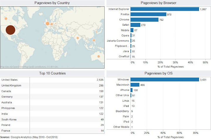
I've made the following changes/improvements:
- The left half of the dashboard the same, except that I was limited to bubbles on the map since I built this with Tableau's standard features. I prefer the filled in countries, and I know there are workarounds in Tableau, but I think this map makes the variance easier to see since I used an orange-brown color pallet.
- I did not change the reference table below the map.
- On the right, I have combined the pie charts and tables into a single view. The bar charts are listed in descending order by % of total pageviews and labeled with the # of pageviews. It's much easier to make sense of the bar charts than the pie charts.
Subscribe to:
Post Comments
(
Atom
)


No comments
Post a Comment