November 24, 2010
Failed Banks in the US: Popping the Bubbles
Simon Rogers from the Guardian created a visualization of failed banks in the US using Many Eyes. The article can be found here. Before I critique the visualization, take a minute to interact with the bubbles.
A quick word about data integrity. The article on the Guardian references the data going back to 1935, and in fact, the data compiled does go back to 1935. I made the assumption that the viz created by Simon went back that far as well, but then I couldn’t find a year filter. If you look at the data that built the bubble chart, it only covers 2008-2010 and all three years are combined. But 2010 isn’t even a complete year. Come on already! This can be extremely misleading and should be clearly noted, but it’s not!
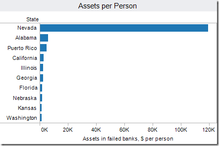
The initial view above is assets in failed banks as dollars per person.
- The huge bubble for Nevada surely stands out, but why not a simple bar chart?
- Notice that Total is listed as a State; that doesn’t make any sense.
- Which state is #2? How about #5? It takes some work.
- Do we really care about all 50 States or maybe just the top 10?
- How much bigger is Nevada than the #2 state?
It’s so much easier to compare the size of the bars than the size of the bubbles. From the bar chart, you can easily see the rank and the relative size of each bar. It turns out that Nevada is 20x larger than Alabama. There’s absolutely no way you can identify that in the bubble chart.
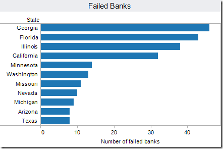
Change the Bubbles Size option to Number of failed banks. Holy smokes! What state is collapsing? Oh, it’s not a state; it’s that pesky Total again. The Total completely distorts the view and makes all other comparisons impossible. Again, a simple bar chart will suffice.
Finally, since there are two data points that are highlighted by the article (assets per person and number of failed banks), a scatter plot provides one of the best means of seeing the relationship between the two. In this view, you immediately see the five outliers I have labeled below.

Scroll through the other filters and you continue to see that including Total as a State completely wrecks any insight that could be gleamed from the viz.
The viz below was built with Tableau Public and it includes the data all the way back to 1935. However, I decided to only focus on the last 20 years; this time period represents the most volatility since the Great Depression.
NOTE: 2005 and 2006 are not included since there were not any bank failures listed on the FDIC website for those years. I also excluded 2010 since the year is not complete.
There are three visualizations included. The line chart (and size) represents the number of bank failures. The color indicates the estimated loss (adjusted to the value of the dollar as of 31 Dec 2009). When you choose a Year, you will get the corresponding map and bar charts. The map and bar chart are sized and colored in the same manner as the line chart.

Naturally, I went straight to 1989. Texas had 224 bank failures! Then I went to the surrounding years and Texas was at the top of the list again. It turns out that there was a banking collapse in Texas in the middle 1980s to early 1990s.
According to the Dallas Morning News: “In the state's 1980s collapse, an energy bust and a subsequent real-estate wreck leveled hundreds of Texas banks, including longtime pillars of the economy.”
Sound familiar?


No comments
Post a Comment