December 6, 2011
When income grows, who gains? Find out for yourself.
decline
,
economy
,
growth
,
income
,
inequality
,
interactive
,
pie chart
,
State of Working America
,
time series
,
trend
No comments
Anyone who follow this blog know how much I despise pie charts, but there are times when I tip my cap to someone that does them well. As much as it pains me to say it, pie charts are not ALWAYS evil.
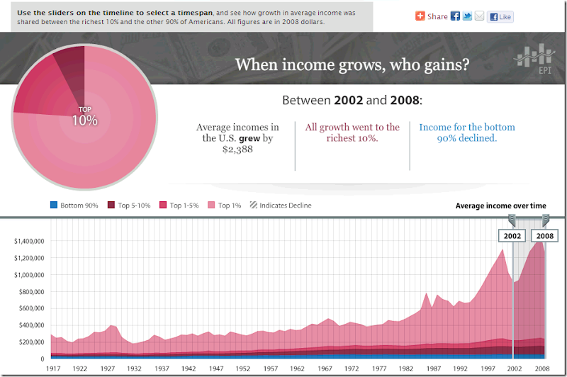
The viz below is a great example of how to use a pie chart well (from the State of Working America blog):
- There are a maximum of four slices to this pie chart
- You can very quickly see how dominant one slice is versus the others
- The colors contrast well enough to not have to constantly refer to the legend
Click on the image to interact (you will be taken to the source site).
I guess what caught me most off-guard about this chart is the summary text when you choose 2002-2008. All income growth went to the top 10%. I had no idea! A great chart can indeed tell a great story, or better yet, let the reader discover the story for themselves.
Subscribe to:
Post Comments
(
Atom
)


No comments
Post a Comment