September 23, 2014
Facebook Jeopardy: My users are creating spaghetti charts and I might hurt someone!
#data14
,
container
,
facebook
,
filter
,
jeopardy
,
size
,
tableau customer conference
,
tips
,
tricks
7 comments
First, thank you to everyone that made it to our session at #DATA14. This was one of the most fun presentations I have ever given. We hope you enjoyed it as much as we did.
This is the first in a series of six blog posts from the Jeopardy questions I answered. Bryan will be posting his solutions on his blog.
To start, here is a video of the final solution as demoed at #DATA14:
And here is an interactive workbook for you to play try it yourself. There are two basic rules in this example:
Now let me walk you through how I did this.
I need to create two worksheets. The first is a simple line chart with a line for each country.

Next, create a calculated field to check how many countries have been selected. I do this with the Size() function. I'm checking if there are five or fewer countries selected.

I then place this calculated field on the Filters shelf and choose True (or exclude False).
The second worksheet is the same as the first, except country is not on the Color shelf, therefore I only have a single line.

On this view, I need to add a filter so that the chart only appears when there are six or more countries selected. I do this by Right-click dragging +Drag (on a PC) or Ctrl+Drag (on a Mac) the Country Name field to the filter shelf and set it to At Least 6.

The last step is to place both worksheets on a dashboard, but there's a trick. First, drag a Vertical container onto the dashboard.

Next, place both worksheets inside the container. I've drawn a border around the two sheets for emphasis.

Notice how the titles automatically appear when you added the worksheets to the dashboard. Hide the titles and, like magic, it will look like one of your sheets has disappeared.
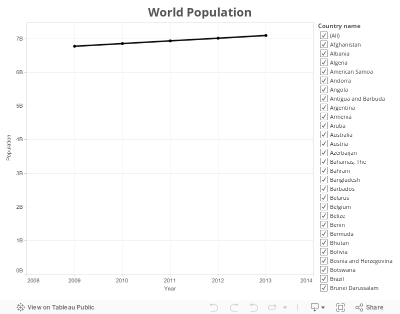
When I have more than five countries selected, you see the single line view.
 And when you pick five or less, you see each individual country.
 Download the workbook here and go build something awesome!
This is the first in a series of six blog posts from the Jeopardy questions I answered. Bryan will be posting his solutions on his blog.
To start, here is a video of the final solution as demoed at #DATA14:
- If five or fewer countries are selected, show each country individually.
- If more than five countries are selected, show a summary.
Now let me walk you through how I did this.
I need to create two worksheets. The first is a simple line chart with a line for each country.
Next, create a calculated field to check how many countries have been selected. I do this with the Size() function. I'm checking if there are five or fewer countries selected.
I then place this calculated field on the Filters shelf and choose True (or exclude False).
The second worksheet is the same as the first, except country is not on the Color shelf, therefore I only have a single line.
On this view, I need to add a filter so that the chart only appears when there are six or more countries selected. I do this by Right-click dragging +Drag (on a PC) or Ctrl+Drag (on a Mac) the Country Name field to the filter shelf and set it to At Least 6.
The last step is to place both worksheets on a dashboard, but there's a trick. First, drag a Vertical container onto the dashboard.
Next, place both worksheets inside the container. I've drawn a border around the two sheets for emphasis.
Notice how the titles automatically appear when you added the worksheets to the dashboard. Hide the titles and, like magic, it will look like one of your sheets has disappeared.
When I have more than five countries selected, you see the single line view.
Subscribe to:
Post Comments
(
Atom
)


Arghhhh! I never thought about using size for this! I've tried to do this often, but never landed on something so simple! Well done Andy!
ReplyDeleteHi Andy,
ReplyDeleteAs an alternative, I believe one can get this functionality from a single sheet using the set + calculated field solution described as the answer to question #3 of the Master Tableau Apprach post:
http://redheadedstepdata.io/master-tableau-approach
Cheers!
Keith
Ah yes! Great idea Keith!
DeleteAny way that you share the blog post to the data visualization tip presented around the 22nd minute? I would absolutely love to reproduce.
ReplyDeleteThat's next on my list!
DeleteHi, did you ever get a chance to put an example up?
ReplyDeleteBobby, I wrote about this one here - http://vizwiz.blogspot.com.br/2014/10/facebook-jeopardy-accordion-views.html. Would more detailed instruction be necessary?
Delete