June 1, 2015
Makeover Monday: China Is Poised to Surpass the Americas as Apple's Largest Market
apple
,
Chart of the Day
,
emphasis
,
line chart
,
Makeover Monday
,
revenue
,
stacked bar chart
,
storytelling with data
No comments

I am not a very big fan of stacked bar charts, particularly those that try to represent change over time, like this week’s makeover candidate from Chart of the Day.

The article is trying to emphasize the change in the share of Apple revenue in China compared to the Americas. Here are some problems I have with this chart:
For the makeover, I’m going back to some of the things I learned in Cole Nussbuamer’s fantastic course about emphasising the data that you want people to pay attention to.
Here’s what I’ve done differently:
Which version do you prefer? What would you do differently? There are so many ways to redesign charts and no single way is 100% correct.
- It’s very hard to compare stacks in a bar chart over time because each stack is influenced by those stacks below it.
- The title of the article and the chart don’t match. The article says China vs. the US, but the chart is China vs. the Americas.
- There is not enough emphasis on the comparison. The rest of the regions should fall to the background.
- I don’t like the legend above the chart in this case because I’m constantly having to go back and forth.
For the makeover, I’m going back to some of the things I learned in Cole Nussbuamer’s fantastic course about emphasising the data that you want people to pay attention to.
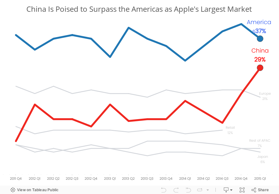
Here’s what I’ve done differently:
- I changed the title to reflect the purpose of the story.
- I changed the chart to a line chart to make it easier to see the trends for each region.
- I’m only emphasising the Americas and China. The rest of the regions are in a light grey.
- I’ve added annotations to make it easier for the reader to see the values.
- I removed the color legend as it’s not necessary since I’ve labeled the end of each line.
Which version do you prefer? What would you do differently? There are so many ways to redesign charts and no single way is 100% correct.
Subscribe to:
Post Comments
(
Atom
)


No comments
Post a Comment